
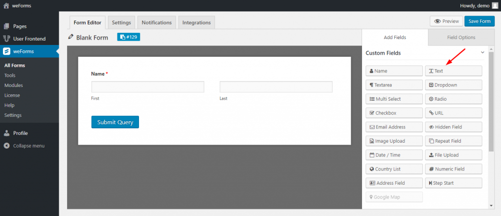
With weForms Text field, you can allow a user to input only a single line of text in your WordPress contact form. To add this field, you can either click on the Text Field or drag and drop the Text field into the builder.
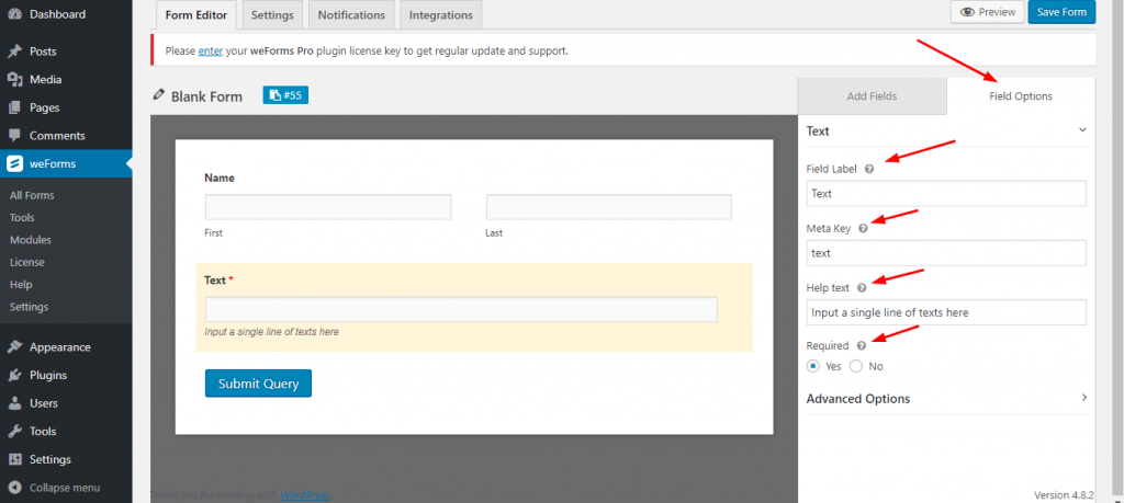
Text Field Options
Text Field consists of the following:
- Field Label: This is used to specify the purpose of the field
- Meta Key: Although the meta key is automatically generated while editing the text label, you can still edit the meta key.
- Help Text: Helps indicate what you wish the user to enter in your text field
- Required: Use this to determine whether the field must be filled out or optional. If you enable the required option an asterisk mark(*) will appear just beside the Text Field‘s Label.
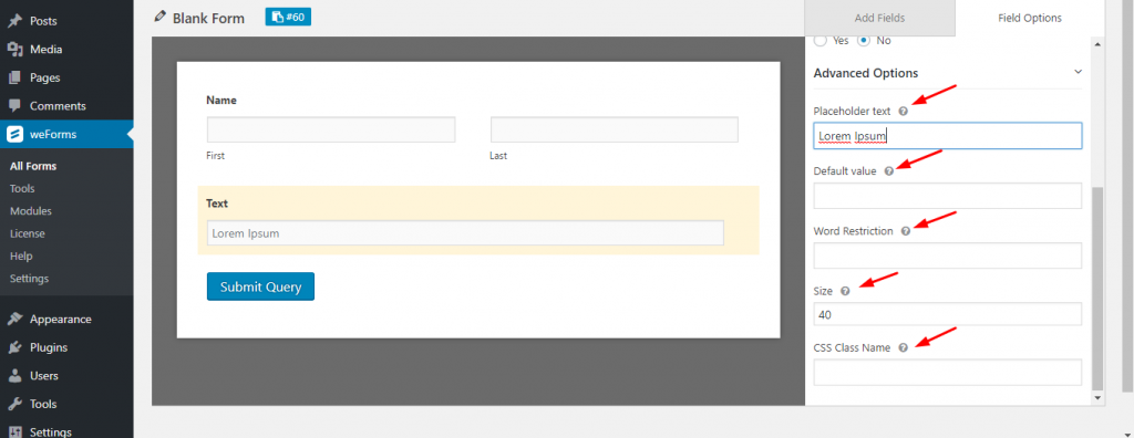
Advanced Options
Click on the advanced options right below the required options of the Text field.
Advanced Options include:
- Placeholder text: Placeholder text will show inside the field but when the user will write something then the placeholder texts will disappear. Great for providing examples of what to enter.
- Default value: The written text in the default value will show as the default text inside the field. Unlike the placeholder text, the default value will not disappear while the user inputs text.
- Word Restriction: Restrict the number of words that a user can input inside the text field.
- Size: Control the text field’s size by increasing or decreasing the unit.
- CSS Class Name: Add a CSS Class Name for this field.
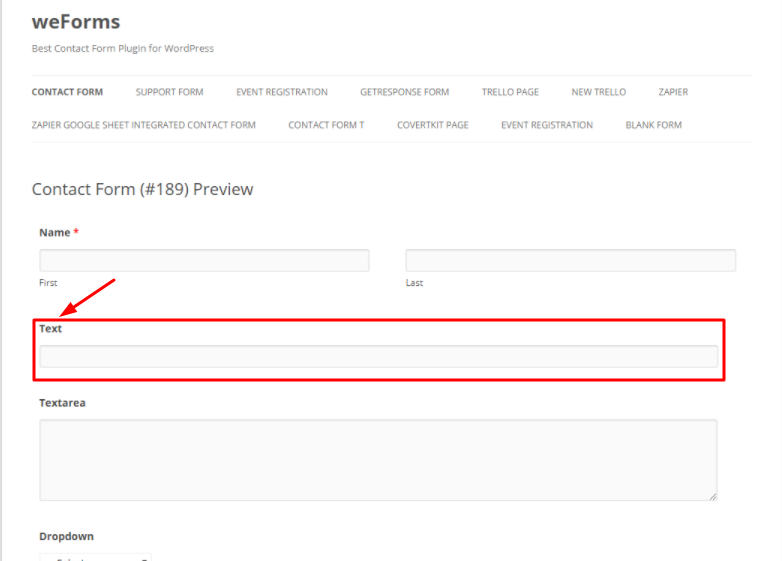
Front-end preview of the Text Field
Below is a screenshot that demonstrates the frontend view or how the users will see the Text Field:
For any further queries, contact our support team.